
Typography for Blogs
Building a beautiful reading experience is a lot harder than it looks. On the surface, you’ve heard a couple of rules and thought, “yeah if I follow these rules, I’ll have 90% of what a great blogging platform has.” Reality is a little bit more complicated:
I had a couple of longer blog posts up, and for some reason, they weren’t as legible as the average Medium article. Why aren’t they as legible? Why do people say they’re sort of hard to read? The font is sans-serif, it’s a fair size, and the lines aren’t too long. What exactly is wrong? Plenty.
Serif vs. Sans-Serif
While the general rule for web content is to use sans-serif fonts, for most long-form websites, serif fonts are used.
I don’t understand how, in my attempt to emulate Medium, I missed that their body font was actually a serif font. Same with Smashing Magazine, the New York Times, and the Washington Post.
Basically; for long-form pieces, stick to serif fonts; they look more “official” and serious.
Sans-serif fonts are still fine for titles, and short descriptions. Even rather short articles like you would see on CNN.com, or the descriptions of articles on the Washington Post are sans-serif.
DPI
The reason that sans-serif fonts have long been recommended for web content is that the DPI (dots per inch) for screens used to be way lower than print media, and it’s hard to see the little “feet” on serif fonts. Now, it still is lower, but screens have improved enough in recent years that DPI is no longer a concern when it comes to the serif or sans-serif decision.
Line Height
Usually, you’re fine with setting the line height around 1.5 (MS Word default) or 1.6 (Web recommendation). That’s all. Most other heights are far too sparse or way too dense.
Characters per Line
Make sure the maximum number of characters per line is 85. Use a tool to count the characters (don’t count them yourself like I did). The ideal length is normally considered 45-75 characters for print, and up to 85 characters for web content.
Font Size
For reading, the font size should be no less than 16pt. Medium.com uses 21pt, my website uses 20pt, and the New York Times uses 16pt for reference.
The Golden Ratio
Whatever settings you decided on, you’d probably want to know the ideal ratios between the three elements. Luckily we have the golden ratio to help us out. Here is a useful calculator to find the ideal ratios of the elements. I found that the golden ratio settings were extremely close to my own, (off by only a couple pixels) and I did a lot of trial and error to be satisfied with my typography. Obviously, there are more concerns than typography on a webpage so you don’t have to follow the calculator to the pixel, but it’s a good reference guide.
The Results
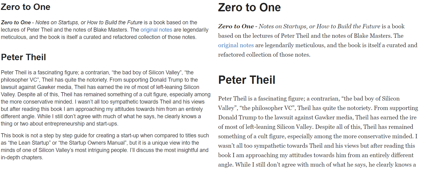
Open the image in another tab and look at both carefully. You’ll see that while the original (left) is consistent and dense, the updated typography (right) is far easier to actually read. When I look at the two side by side, I was amazed that I even put up with the original. The updated typography is begging me to read it while the original was intimidating.
Unfortunately, perfecting typography alone isn’t enough to make reading a delight.
Web Design
The greatest typography in the world won’t hide ugly, confusing, or distracting elements in your page. People have very short attention spans, and cultivating them is the most important part of any web page. When the user is reading, leave them alone. Don’t have distracting sidebars or a huge top navbar. Look to Medium for example. The nav goes away while the user is reading. Most reading-focused websites have extremely sparse elements once the user starts reading. The text should be the focus.
Stick with white backgrounds and black/dark gray text; it’s high contrast and easy to read. Colored text is only to be used as highlights or for links: it’s fairly difficult to make it look professional looking as body text. Colored backgrounds tend not to work unless they’re fairly subtle: you don’t want the background of the text to be the focus.
These aren’t concrete rules, but if you know enough to deviate from them (hint: you don’t); you’re probably not getting much out of this post anyway.
Content
Don’t be boring.
Conclusion
Design is a lot harder than it looks; don’t brush it aside and only pay attention to a couple rules you heard once. Great, functional design will keep people engaged, and that is the entire point of blogging or writing. Content is important, but what the content looks like is equally important. Not many people will read a 10pt Times New Roman wall of text, no matter how amazing the information inside is. If you want people to get your message, don’t make it unnecessarily difficult! The internet is a battleground for attention, and if your content doesn’t have the best armor, it’s getting killed.